


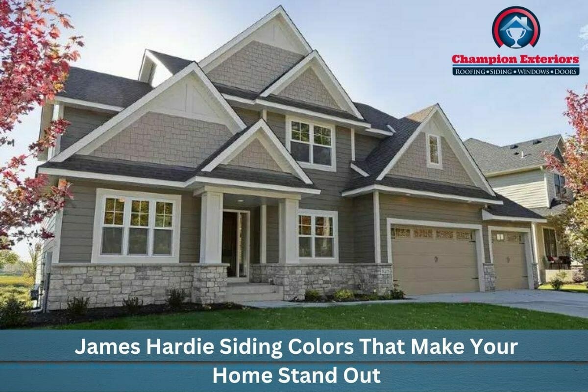
Do you want to add personality and curb appeal to your exterior? Look no further than James Hardie’s siding. With a wide range of color options, you can easily find a color that complements your style and makes your home stand out. In this blog post, we’ll take a closer look at 14 of the most popular James Hardie siding colors and explore how they can transform the look of your home. Read on to install long-lasting siding on your home.
Understanding James Hardie Siding
James Hardie siding is one of the most popular siding brands on the market. While surfing through the pages on the internet, you might have seen it listed on almost every siding page. The reason for its popularity is simple. James Hardie siding is the most durable and versatile option for home and business owners when it comes to selecting a siding. James Hardie siding gives homes an outstanding aesthetic and curb appeal while also providing strong protection against elements and intruders.
Unlike wood and vinyl siding, which are prone to damage and have a short lifespan, Hardie siding helps homes and businesses become energy efficient and environmentally friendly.
In addition, the range of colors and designs available for this type of siding is vast, which can make it complicated for building owners to settle on a decision. In the following blog post, we have provided a list of vibrant, neutral, warm, and cool colors for this siding, to assist you in selecting one that complements the architecture of your home.
Popular James Hardie Siding Colors
We hope that from the following list of James Hardie siding colors, you’ll be able to select one that will complement your home.
Cool Tones
1. Iron Gray
Iron Gray is a rich, dark gray color that provides a bold contrast to lighter trim colors. This color is perfect for homes with a modern or contemporary design, as it complements the sharp angles and sleek lines often found with these styles.
One of the benefits of Iron Gray is that it works well with a variety of accent colors. For example, you could pair it with white trim and black shutters for a classic look or choose a bright color like yellow or red to create a more playful, eclectic feel.
2. Boothbay Blue
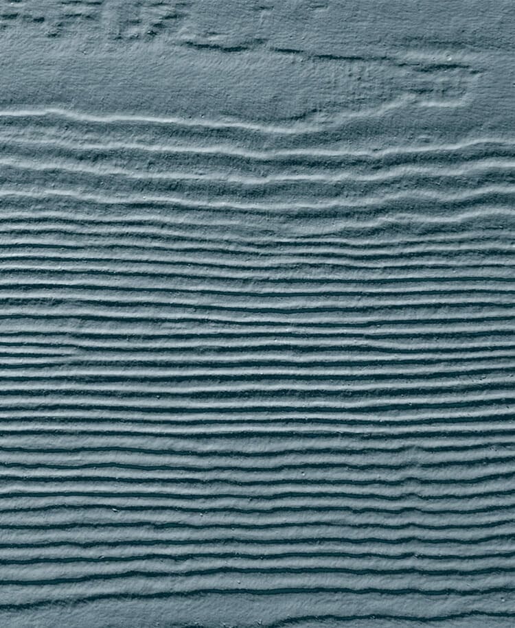
Boothbay Blue is a calming blue-gray color that captures the essence of serenity. Its soft tones make it an ideal choice for those who love blue, but also want a more subtle option for their home’s exterior.
Pairing Boothbay Blue with clean white trim creates a timeless, classic combination that exudes sophistication. Additionally, adding a touch of red brick to a porch or around the foundation can ground the design and provide a subtle texture that complements the color scheme.
Whether you’re looking for a color that will bring a sense of tranquility to your home, or a classic color combination that will make your home stand out, Boothbay Blue is a versatile choice that is sure to impress.
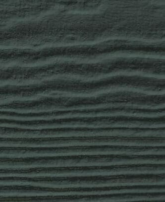
3. Night Gray
Dark hues can add a touch of romance, mystery, and sophistication to your home’s exterior design. Night Gray, a rich and deep shade of gray, automatically adds depth and drama to your home’s appearance.
Night Gray is a bold color that exudes confidence, making it a great choice for homeowners who want to make a statement with their home’s exterior. Playing with board widths and textures can enhance your home’s overall style and visual interest.
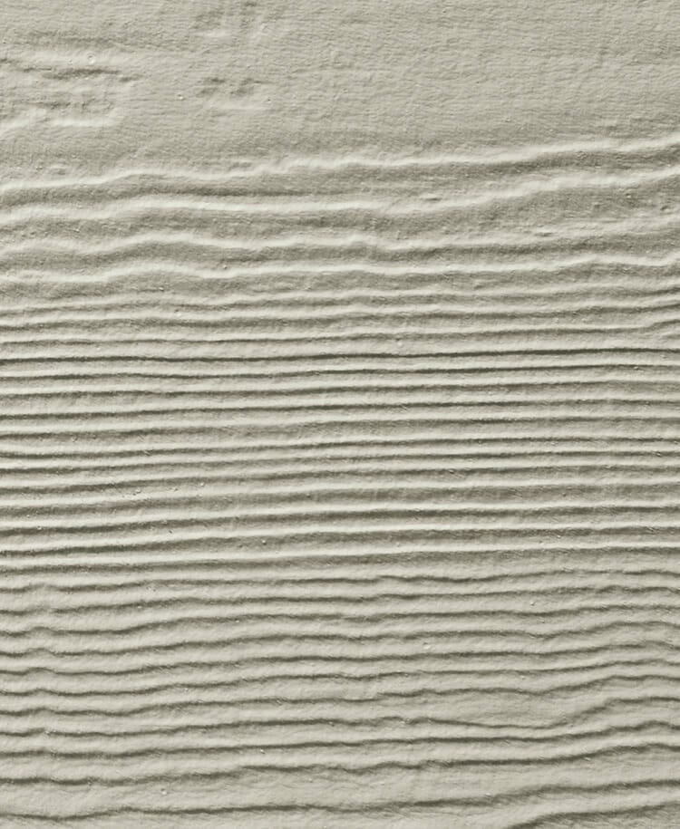
4. Pearl Gray
Pearl Gray is a soft, light neutral color that draws inspiration from the soothing hues of nature, such as sand and seashells. Its versatility allows it to be used as a subtle accent color, or as the main color for an entire house.
With its classic and neutral tone, Pearl Gray is a timeless choice that can complement both traditional and modern decor styles. This color has a sophisticated and elegant feel that adds a touch of refinement to any space.
Warm Tones
5. Countrylane Red
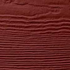
Countrylane Red is a warm and inviting color that evokes memories of driving through the countryside and passing by red farmhouses nestled among fields of corn. This shade offers just the right amount of character without overwhelming the eye.
Countrylane Red pairs with neutral trim colors such as Navajo Beige to create a welcoming and traditional feel. The contrast between the two colors adds visual interest and depth to your home’s exterior design.
Whether you live in the city or the countryside, Countrylane Red is a versatile color that can add a touch of warmth and comfort to any home. Its classic appeal is sure to make your home stand out and leave a lasting impression.
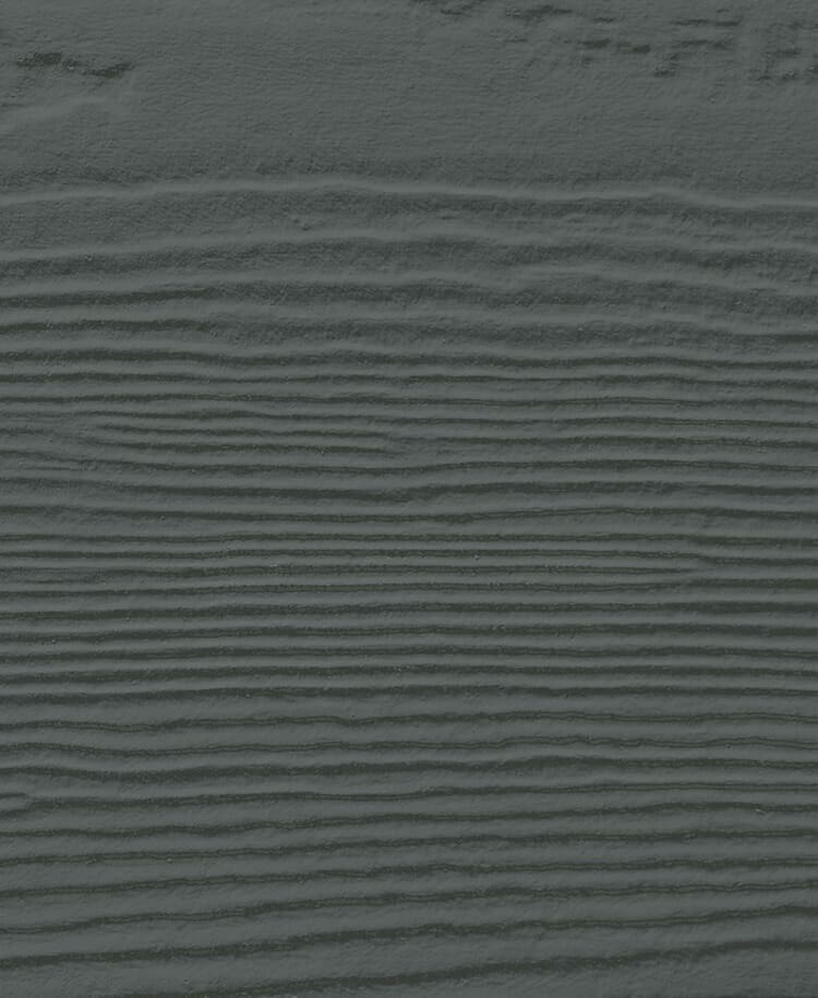
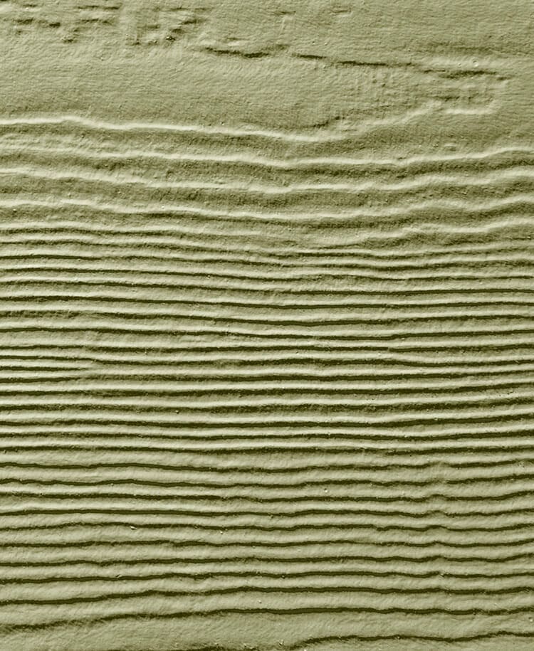
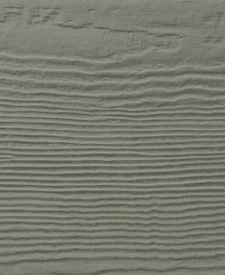
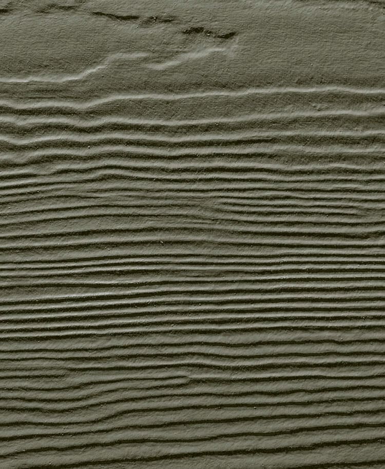
6. Aged Pewter

This color offers neutrality with character. With its warmth and versatility, Aged Pewter is an ideal accompaniment to beige and other shades of gray. If you desire some color without excessive vibrancy, Aged Pewter represents an excellent selection. To create a more neutral appearance, pair it with lighter hues, or for added drama, pair it with darker shades.
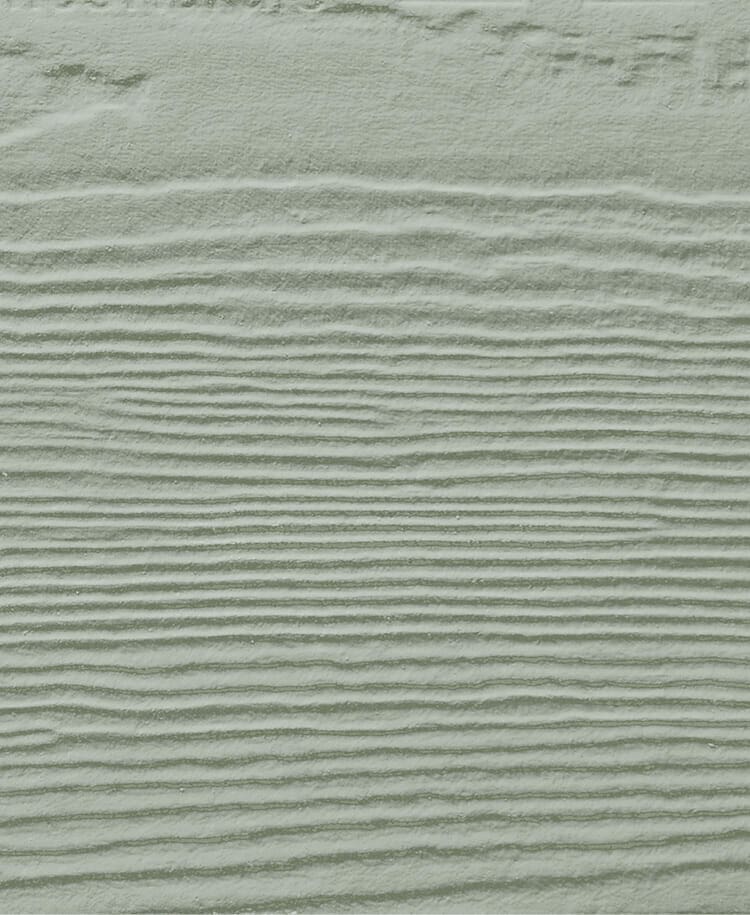
7. Heathered Moss
Add lively greenery to your space with Heathered Moss, a welcoming color that will make you feel like you’re in a cozy cabin retreat every day. This subtle green shade pairs nicely with darker colors like Iron Gray and other greens such as Mountain Sage.
In addition, Heathered Moss also pairs exceptionally well with natural wood tones, such as oak or walnut, to create a rustic and warm ambiance. You can also use it as an accent wall to add depth and interest to a room or as a dominant color to evoke a serene and calming atmosphere.
Neutral Tones
8. Arctic White
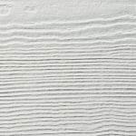
The snow-capped mountains and the initial snowflakes of winter represent the purest shades of white. Classic white never goes out of style, whether used as the primary color for your home’s exterior or as an accent to complement darker hues. If you’ve always found white to be dull, reconsider its potential!
In addition to its timeless elegance, white can make a space feel more spacious, brighter, and cleaner. A white exterior can help reflect sunlight, reducing the need for artificial lighting and keeping the interior cool during hot summer months.
Furthermore, white is a versatile color that complements any design style, from traditional to modern. For a classic look, pair white with black or gray accents. Or, add pops of bright colors or metallic finishes for a more contemporary feel.
9. Cobble Stone
Cobble Stone represents a luxurious neutral shade that can elevate the appearance of any home. Its warm undertones and taupe base pair seamlessly with darker accent colors. Its classic and refined quality eliminates the need for complex decision-making. The sophisticated neutral Cobble Stone color can be enhanced with a black door and a striking light fixture to achieve an elegant and cohesive look.
Additionally, Cobble Stone is a color that can transition seamlessly from season to season. Pair it with light and airy colors like soft blues or pastel pinks in the summer to create a fresh and inviting look. In the fall, combine it with warm, earthy hues like burnt orange or deep red to create a cozy and welcoming atmosphere.
10. Navajo Beige
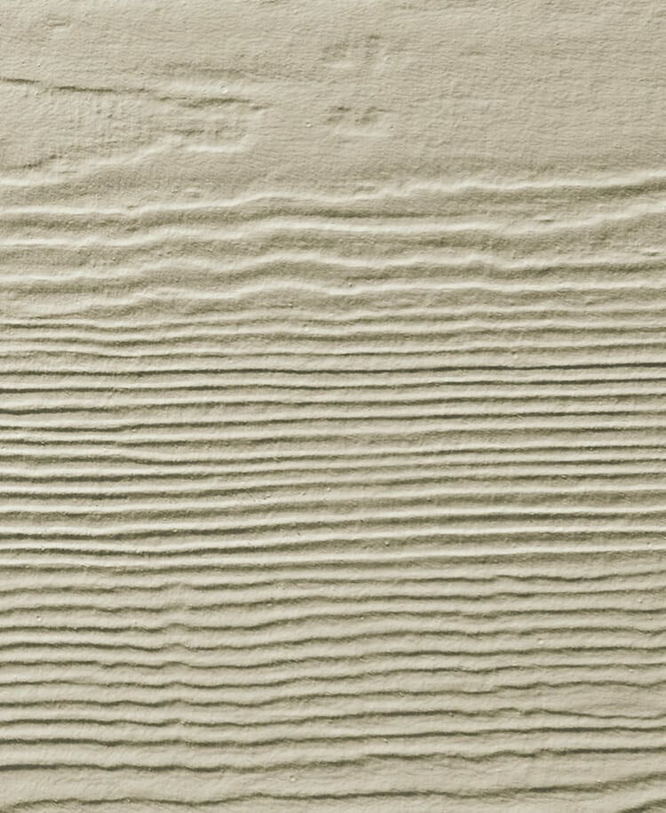
Navajo Beige is a versatile, enduring color that exudes warmth and comfort. Its timeless appeal has made it a popular choice for both residential and commercial properties. Whether you’re looking to create a modern or traditional look, Navajo Beige offers a neutral backdrop that works well with a variety of design styles.
This color is particularly well-suited for stonework, as it provides a natural and harmonious pairing. It is also low maintenance, making it a practical option for busy homeowners or property managers.
11. Light Mist
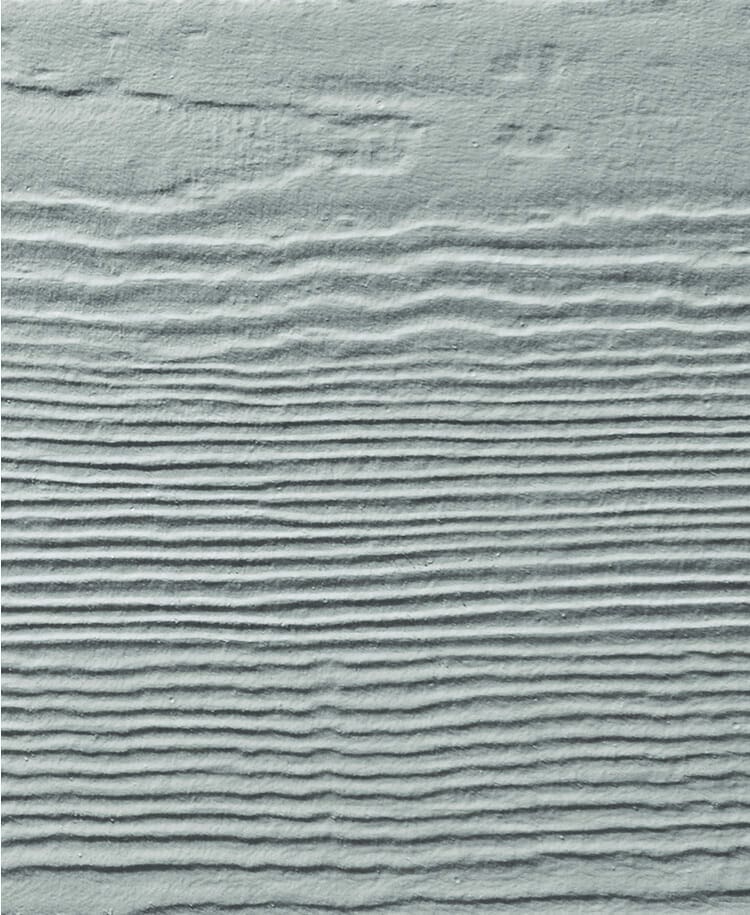
With a gentle touch reminiscent of a foggy day, Light Mist is a delicate shade of gray with a subtle blue undertone that exudes comfort and sophistication. It is a contemporary neutral that brings a sense of cleanliness and freshness to any home.
Light Mist’s soft, pretty hue pairs effortlessly with other neutrals like grays and whites, making it a versatile choice for any decor. It has a refined elegance that is particularly well-suited for warm climates, where its cooling effect can be appreciated.
If you’re looking for a color that is both cozy and cool, Light Mist is definitely worth considering. Its subtle blue tint adds a touch of tranquility to any space, creating a serene and inviting atmosphere that is perfect for unwinding after a long day.
12. Gray Slate
Gray Slate is a versatile and rustic neutral color that can add a cozy and inviting feel to any space. With its deep and rich shade of gray, Gray Slate exudes an air of history and timelessness that works well as an accent or whole house color.
This color is particularly striking when paired with other shades of gray or neutral tones, creating a harmonious and balanced look. It can soften up space while still making a bold statement, adding impact without overwhelming the room.
Brown Siding
13. Timber Bark
Timber Bark is a sophisticated and timeless color that blends deep gray and brown hues for a rich and elegant look. This versatile color can be used as the main body of your home or as an accent, and it will never go out of style.
Timber Bark strikes the perfect balance between light and dark brown, making it a great choice if you’re looking for a color that adds depth and dimension without overwhelming a space. This color can be complemented with white trim or accents to create a beautiful contrast and brighten the room.
14. Khaki Brown
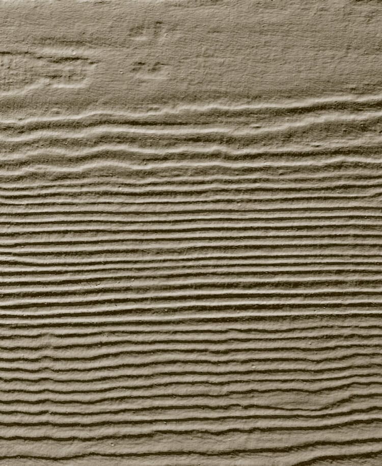
Khaki Brown is a warm, versatile color that pairs effortlessly with darker and lighter hues. Its mid-tone brown shade can create a woodsy ambiance when paired with Heathered Moss or a bolder look combined with Countrylane Red.
As a classic neutral, Khaki Brown is a popular choice that never goes out of style. Its timeless appeal makes it easy to incorporate into any decor style, whether you prefer a traditional or contemporary look. Additionally, its ability to complement other colors makes it an ideal choice for accent walls or as the main color for a whole room.
Do You Want To Install James Hardie Siding On Your Home Or Office?
Installing James Hardie siding with expert help can enhance the curb appeal of your home and provide durable protection as well. If you want to install siding on your New Jersey home, look no further than Champion Exteriors. We are expert roofers and siding installers who can improve the overall aesthetics of your home or roof. Call us today at (609)-845-3576 for a professional consultation.